


Control
Alternative UI Direction
Process
Click to Jump Ahead
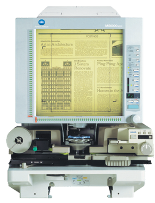
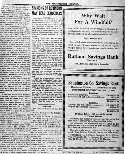
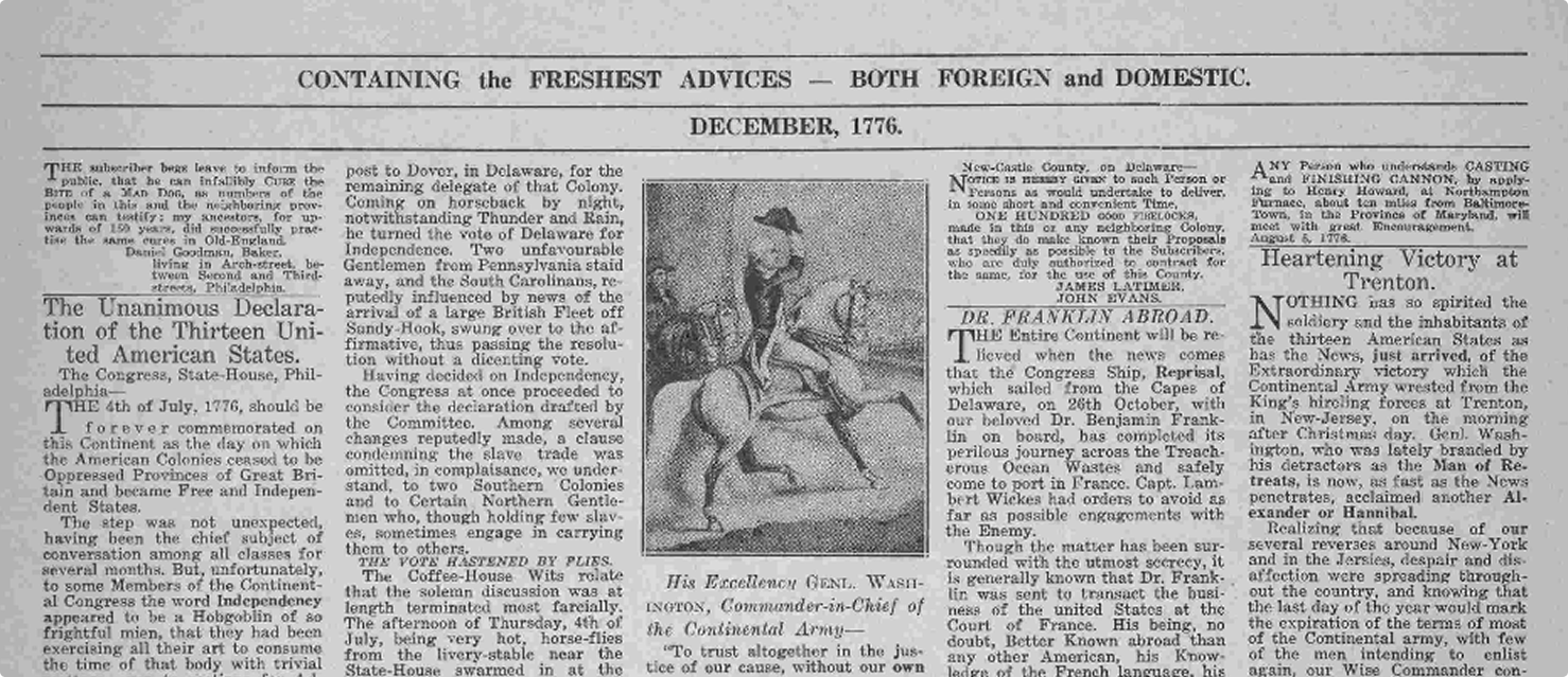
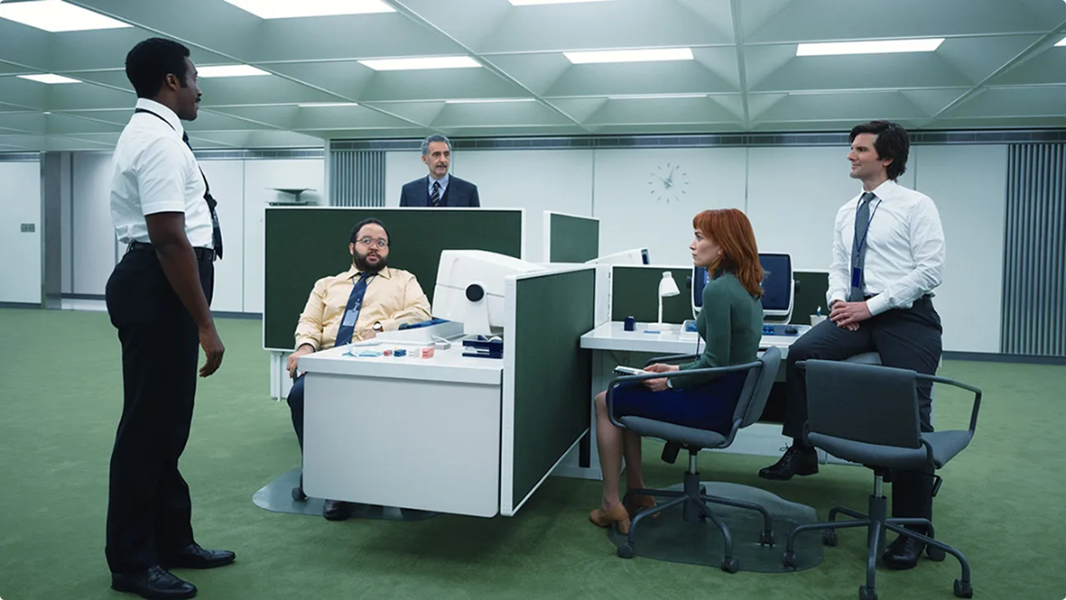
Here, I explore what Control’s UI could have looked like with a more diegetic, era-appropriate direction. Inside the Oldest House, modern technology doesn’t function, so this direction takes inspiration from microfiche readers, American 19th- and 20th-century newspapers, and the visual design of Severance’s mysterious office.
Teardown
Starting with a full-game review, I gathered screenshots, created a screenflow, and organised my critiques into major and minor issues. Below is a summary of the major areas.

View File
Loadout
Astral Constructs
Expeditions
Countermeasures
Wireframes
Lo-fi
x
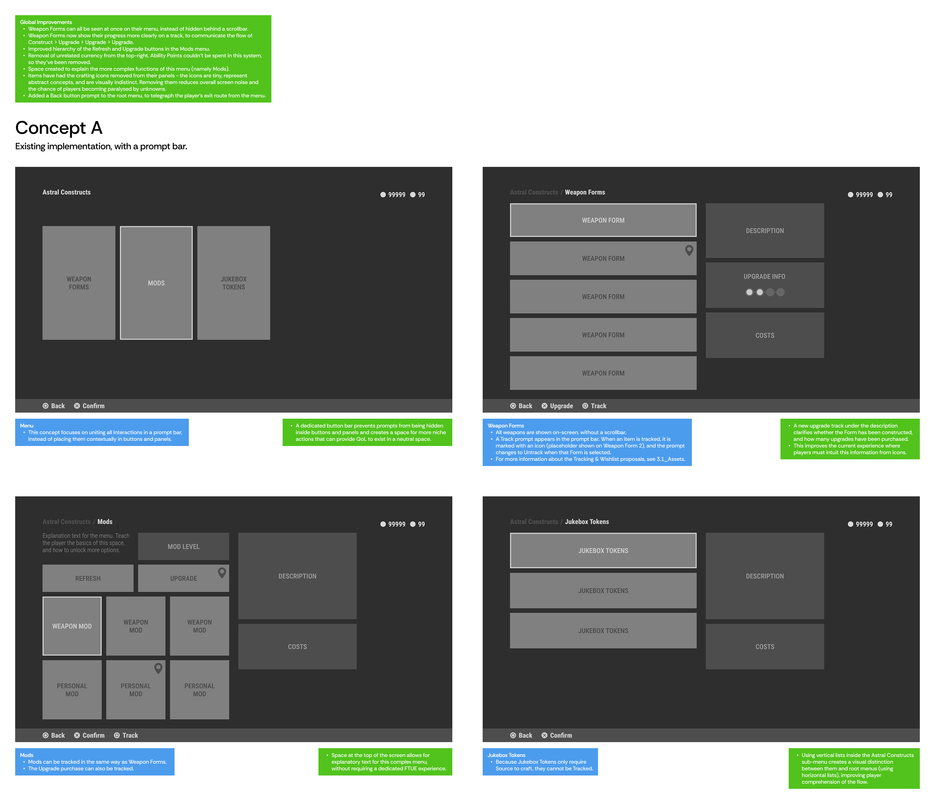
Concept A
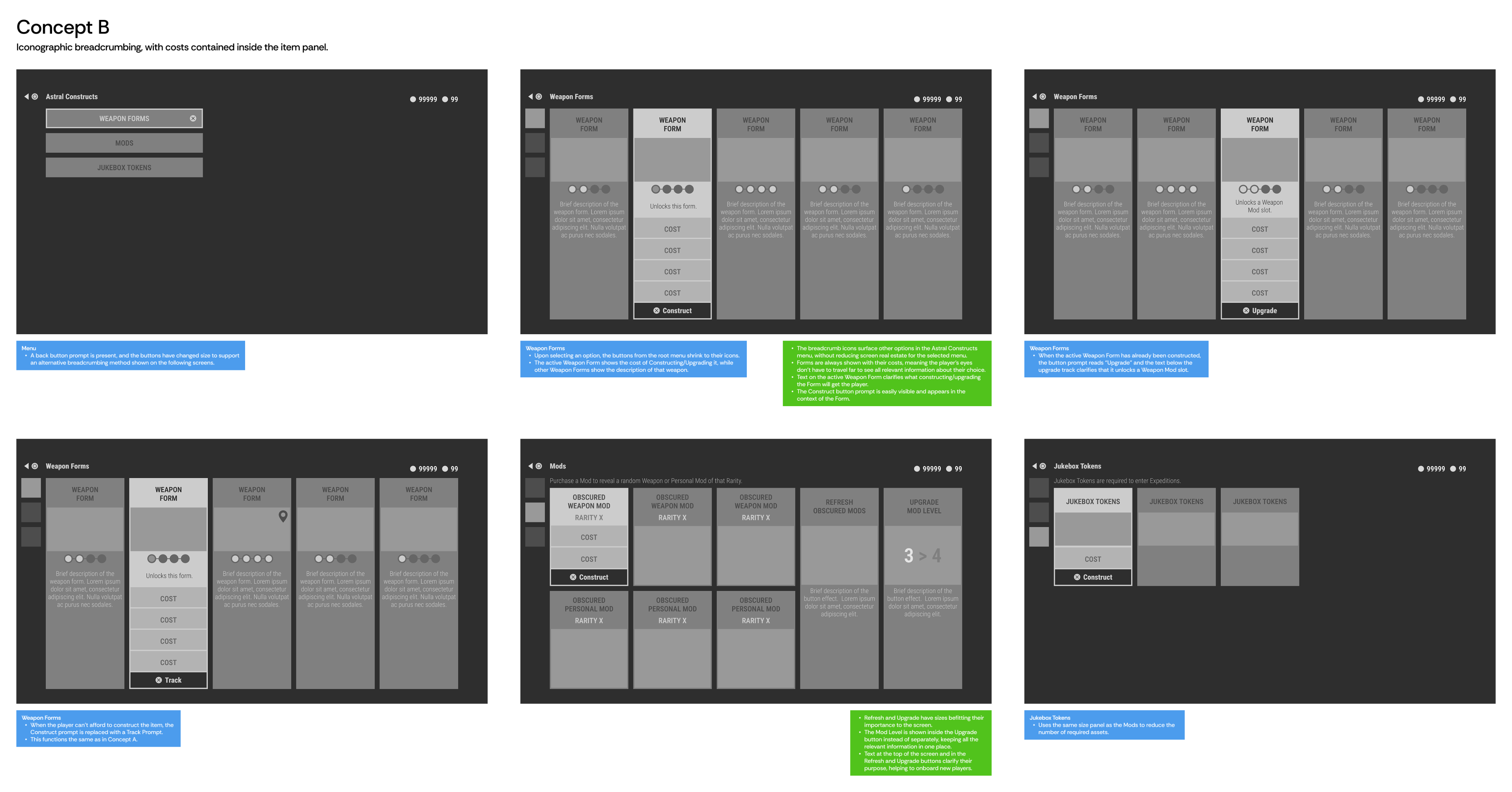
Concept B
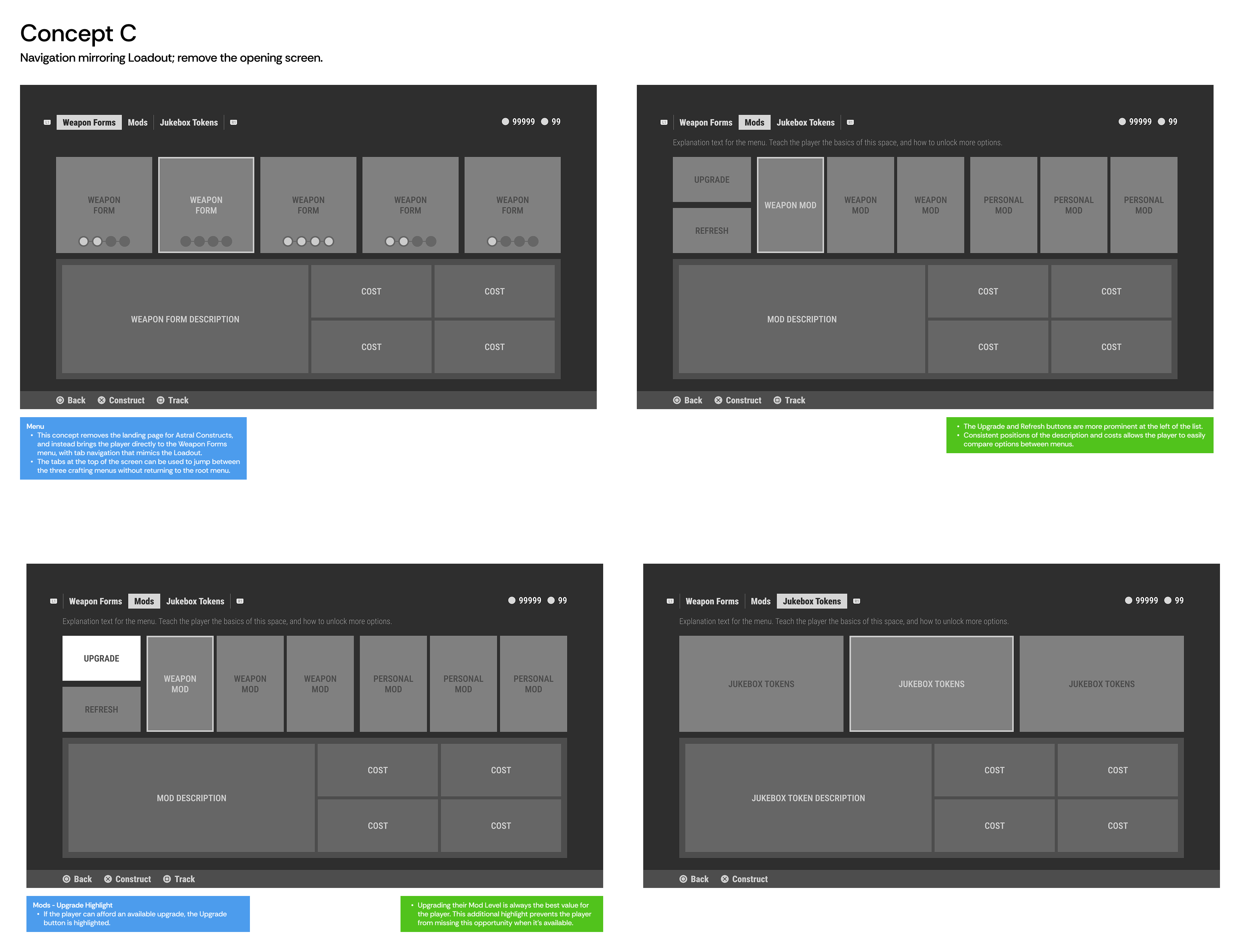
Concept C
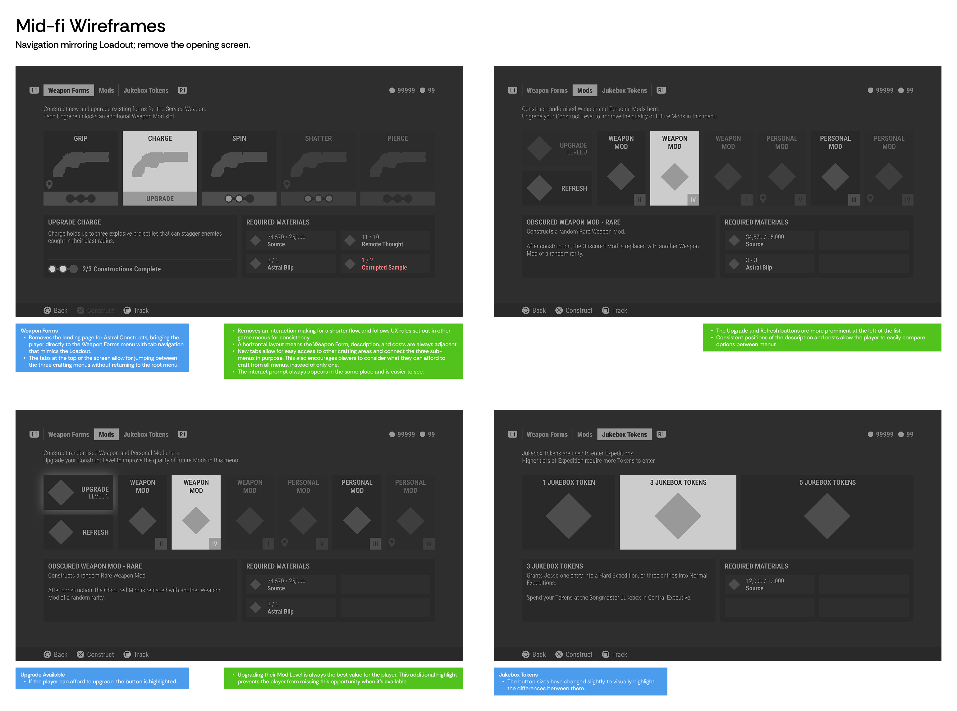
Mid-fi
x
Hi-fi
x
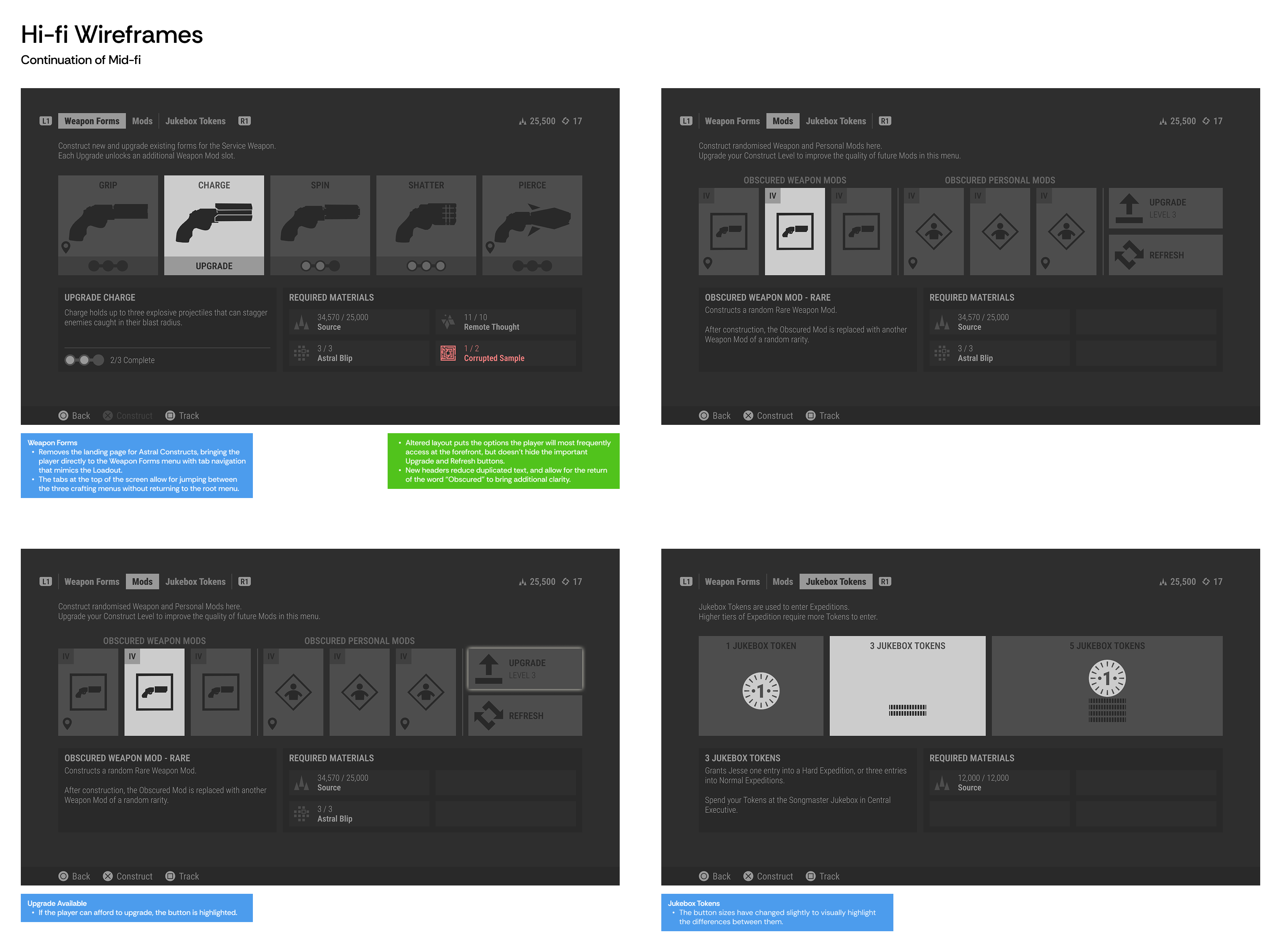
UI Exploration
Selecting two wireframes with the most potential, I then explore options for the UI Direction. Each direction gets its own mood board, with contrasting references, colour palettes, and fonts.
Concept A
Concept B
Final Mood Board

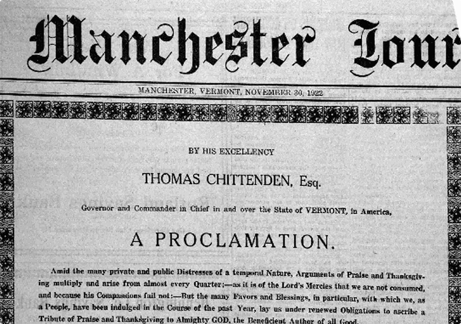
Well-Used
Retro
Unusual
Atmospheric Lighting
Alien
Clinical
Archives
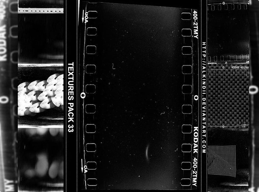
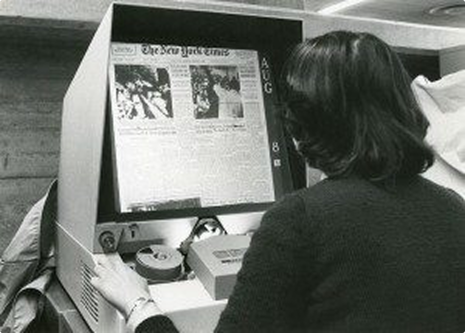
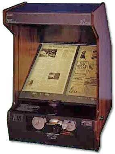

- Fill the screens with nods to the game’s universe.
- Connect the UI more closely to the Bureau’s technology.
- Make the player feel like a detective while exploring the menu.
- Highlight how the Bureau has embedded itself into all aspects of society through the newspaper aesthetic.
Screen Design
Main Menu
Primary Style
Jukebox Style

Loadout